The Project
responsive website
rebranding
small business
Methods
Tools
Figma
Zoom
Context
Siddiq’s Real Fruit Water Ice is a beloved spot for treats in West Philly, founded with a passion for community and a commitment to quality. The current website is quite minimal, with basic details about catering events, a brief backstory, and a career page.
Problem
Although it’s technically responsive, the oversized images hinder usability on both desktop and mobile.
The branding is bold, but it doesn’t create an inviting appeal that makes people crave water ice.
There’s potential to make the site more engaging—especially with a clear narrative showcasing Moore’s local impact and community ties.
How can we preserve the website’s unpretentious, local business feel while strengthening its brand identity and making it more distinctive?
Solution
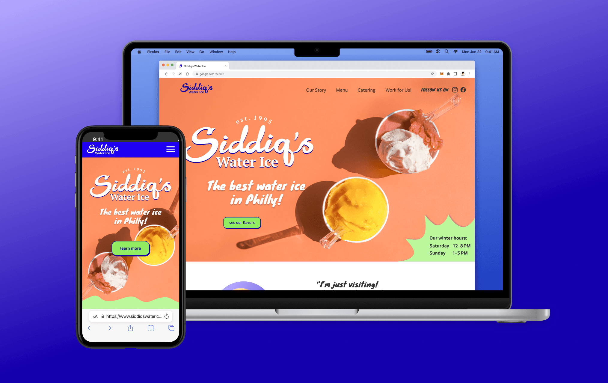
A fully responsive website that enhances Siddiq’s digital presence and converts visitors into customers. Through engaging visuals and compelling storytelling, it will highlight happy customers and strong community connections


I wanted to understand people's expectations of a small business website. I conducted interviews with five participants who also shared their impressions and experiences of the current Siddiq’s website. Their insights into their pain points, expectations, and preferences are invaluable for identifying key areas of improvement and refining the user experience.
For a more comprehensive view of the project, I wanted to be aware of the business, user, and technical goals.
The research came down to a few actionable items that I wanted to make sure to cover:

I used a rudimentary figma wireframe prototype to assess whether the layout and task flow felt intuitive and frictionless. Six people participated in moderated think-aloud sessions, primarily testing the desktop prototype.
Task 1:
How would you find out what the main product is?
Task 2:
Find the mango lemonade water ice and pretzel on the menu.
Task 3:
Find the Philadelphia location’s address
Task 4:
How would you go about getting catering from Siddiq’s?

LOGO
I wanted to make Siddiq’s logo more legible without losing the vibe. I made the lettering thicker, connected the letters, and removed the outline and shadow.


TYPOGRAPHY + ICONS
Many interview participants noted that the text proportions felt off and didn’t fit well on any viewport, especially on desktop. By fine-tuning the scale and enhancing the visual hierarchy, I made the page easier to scan and absorb. I created icons to make the descriptions of catering methods easier to scan and understand. More common icons were added for instant recognition for the contact info.
Proposed Typescale

UI Icons

Illustrative Icons

COLOR
The brand tone needed to be appealing, fun, and playful. Since their famous water ice is a summer treat, I wanted it to remind people of the joy of having a refreshing water ice on a hot summer day. Since Siddiq already has branding with their neon green uniform shirts and bright yellow building, I didn’t want to change the color entirely. Instead, I softened the palette by introducing orange, creating a more balanced and refined look.

UI KIT
Many interview participants noted that the text proportions felt off and didn’t fit well on any viewport, especially on desktop. By fine-tuning the scale and enhancing the visual hierarchy, I made the page easier to scan and absorb. I created icons to make the descriptions of catering methods easier to scan and understand. More common icons were added for instant recognition for the contact info.

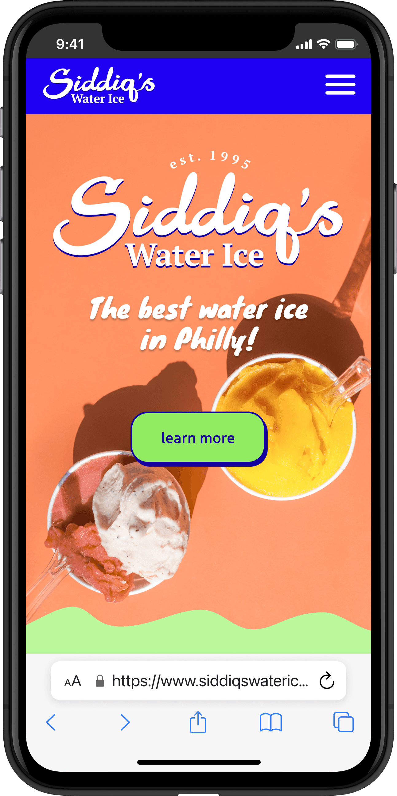
Building on the new brand identity and wireframe tests, I developed interactive high-fidelity prototypes to to incorporate realistic interactions, creating another layer to enhance the user experience. The main change was highlighting the water ice they are famous for on the hero image, and describing what water ice is.

Building on the new brand identity and wireframe tests, I developed interactive high-fidelity prototypes to to incorporate realistic interactions, creating another layer to enhance the user experience. To ensure the branding was on the right track, I also conducted user testing to gather first impressions - evaluating whether the design felt inviting and aligned with both the brand and product.
Since one of the main goals was to emphasize Siddiq’s relationship to the community, the “Our Story” section was moved higher on the page. Usability test participants found that separating “Welcome to Siddiq’s” and “Our Story” made it disjointed. Moving the social media from “Our Story” to the landing page made it feel more current and personable.

Testing also showed that the menu was easily missed, so the tabs were emphasized and the toppings below the items it can go on.

Below is an example of the prototype that was tested. Click around to explore!