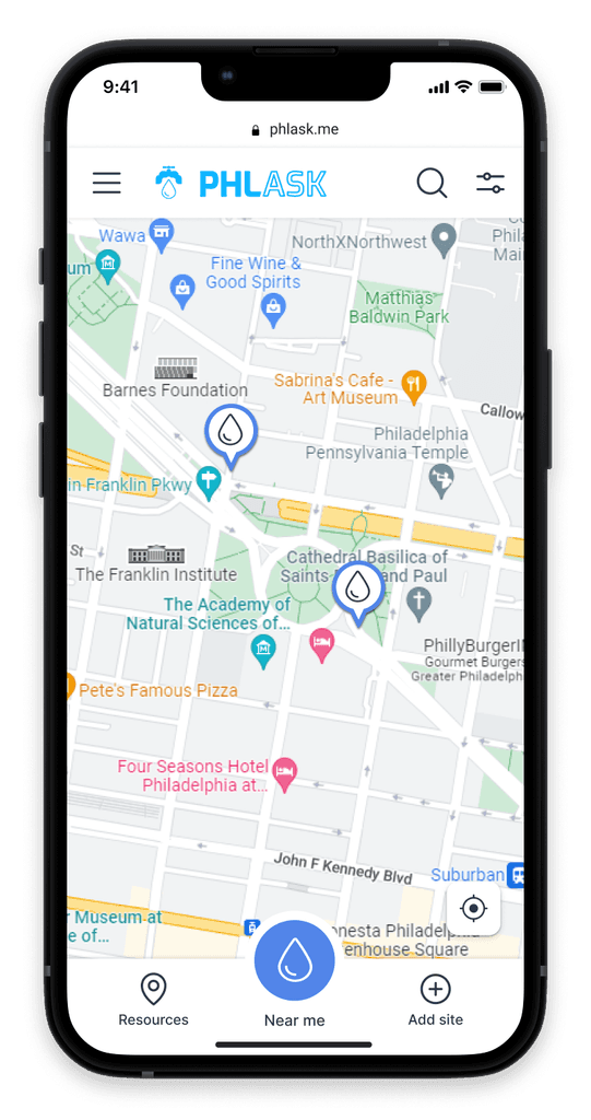
(PHLASK: a pun on the word ‘flask’ to also symbolize Philadelphia (PHL) + Ask; to ‘phlask’ for water)
The PHLASK mission is to help people find publicly available free resources, and to encourage private enterprises to provide public access to their water infrastructure.
The Project
crowdsourcing
design systems
responsive website
Methods
Tools
Figma
Github
Trello
Illustrator
Zoom
As the first volunteer UX designer on the team when I joined, I led the product design process from 2021 to 2024. Although the site was already live, I decided to create a design system from scratch while overhauling the existing design.
As new designers joined I took on the role of a circle convener from keeping track of tickets, onboarding new members, and facilitating decision making. I also created a review process workflow in order for better communication with the development team, and for a tighter feedback loop for the design approval process.
The Challenge
There were a few long term goals that we wanted to achieve with the app. Ultimately, we wanted to create a feeling of interconnectedness between Philadelphians by increasing accessibility to resources and reduce waste. To accomplish this we knew the app had to be successful in a few ways:
Establish a user base that will think of the app to add resources to the map when they come across any in their everyday lives
Have enough resource sites that the app will be useful to people
Encourage establishments to allow public access to their resources
Since we did not have an established user base yet, we started with some assumptions of who our demographic might be. We wanted to find people who look for free resources already, or would benefit from them. With surveys and interviews we gathered data about people's interests and habits around needing and finding free resources.
We interviewed people from different backgrounds, ranging from grandparents living off benefits to professionals who travel throughout the city like mail carriers. I focused on people who used a community fridge in my area. I was able to get a deeper understanding of how the resources are used, their ideas on how to make it better, and what further resources could be useful.
From the research we realized that some user groups would be more specific to certain resources, so we decided to create user personas for each resource: water, food, bathrooms, and foraging.
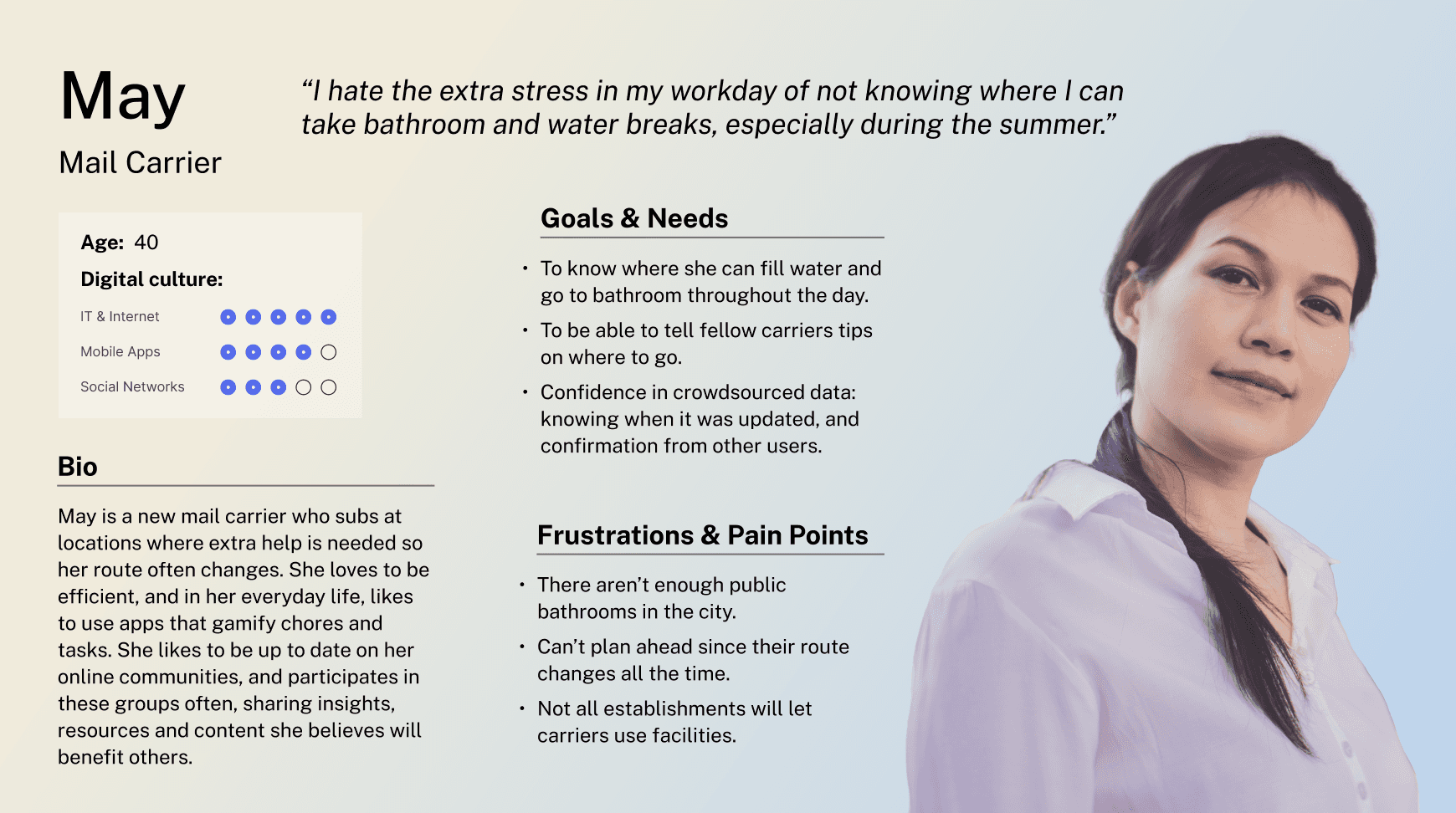
A mail carrier was assigned to the bathroom resource as having bathroom options can relieve an everyday stress.
I established a library in Figma for styles, components, and assets as a source of truth for both designers and developers. This made the design process more efficient by allowing the reuse of components. The main challenge for the visual design was to have different “themes” for each resource map, while keeping a coherent style for the overall app.


Components
Components keep things consistent and making sure it aligns with the design system. We followed the concept of atomic design as much as possible, building from the smallest pieces and combining them to make larger elements. This displays components in an easy way for newcomers and creates a flexible design system.

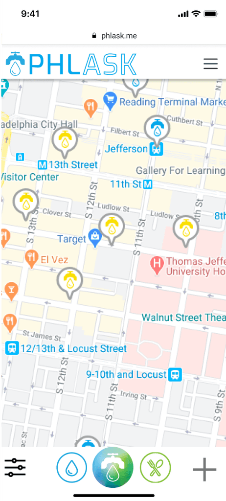
When I joined the project there were only two maps for water and food, but there were already plans for foraging and bathrooms. In order to accommodate more resource types, the first iteration combined all the resources into one pop up menu, shifting the map tools to the navigation bar. This also allows for flexibility in case more resources are added. It also felt important to have as many things labelled as possible if they weren’t typical buttons a user would be used to.

We conducted think-aloud usability tests to observe how users interact and understand the app. One of the main objectives was to show the team that the central button was not intuitive. We wanted to cover a few things in our tests:
Can users understand what the "PHLASK" button does, whether learning from the onboarding or exploring
Is it intuitive to open a map pin and see the full description
Switching between different resource maps
Filtering resources on a map
Adding a resource to a map


Developing a functional prototype allowed users to be more hands on with the app in a virtual meeting. With the features and functionality of the app to be demonstrated more naturally, it made it easier to see whether all the elements were integrated seamlessly.
For this round of usability tests we wanted to confirm whether our solution made sense to the users. Most of the scenarios were the same except we wanted to also test the functionality of the menu, the desktop version, as well as get insight into how people feel about onboarding.
Findings
We were going in the right direction: the central button reflecting which map the user was on was more intuitive. However, the label still caused confusion and people were not sure what it did, although it was explained in the onboarding.
There were also some lower priority issues:
The copy of the filter groups were confusing
we realized that it was important to show that the site won't be immediately added because it needs to be reviewed.
There was more clicking involved on desktop than was needed, hover states were not taken advantage of.
Confirmation that things are correct and up to date - more of a project than the other issues.