UI design
UX
Responsive Website Concept
UX Research
I spoke to 6 people to learn about the experience of taking care of their pet.
Key Takeaways
The importance of:
Keeping track of health tasks
Communication with vet
Everything being in one place
With more time
In hindsight, it could have been useful if
I interviewed more people who:
Isn’t the main pet parent
Has pets with more intensive health needs
Has more than one pet
Has pets that aren't cats and dogs.
People not as literate with technology
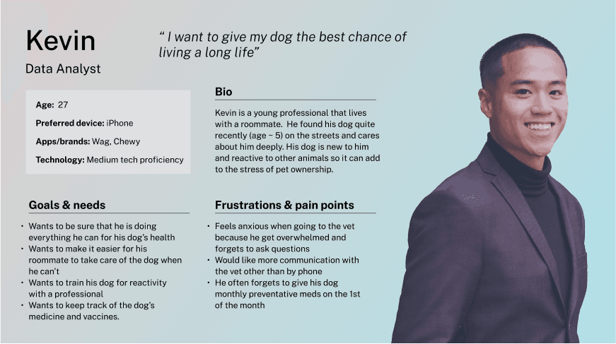
With the data from the interviews I grouped the observations to distinguish patterns. The most prominent themes were the tracking of healthcare tasks, simplicity, communication with the vet, and the use of a calendar. From the affinity mapping I created two personas that covered all the aspects of what I heard in my interviews.
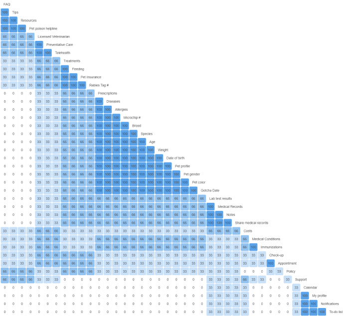
Card Sorting: Hyprid, Unmoderated
Goal: To understand users’ mental model by analyzing how they categorize keywords. This will inform the information architecture (sitemap) and designing user flow. With more time I would get more participants to get a better view of a wider range of mental models.
Surprised at the range of answers
Least agreed upon topics were: cost, appointment, check-up. I think that these would go together in a category.
The category that most people agreed on was “Pet Profile”. This was also the largest category.
Next time I would’ve included a category like “Dashboard” to give me a better idea of the first things people would expect to see.
Prioritizing features
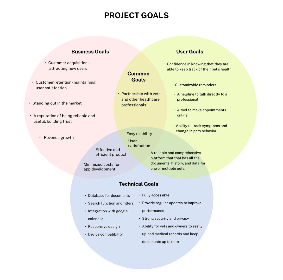
To make this platform valuable to the user it would need lots of features on one platform. However for the sake of time I prioritized the features and decided to focus on the Pet Profile, Dashboard, Task Page, and Symptom Page.
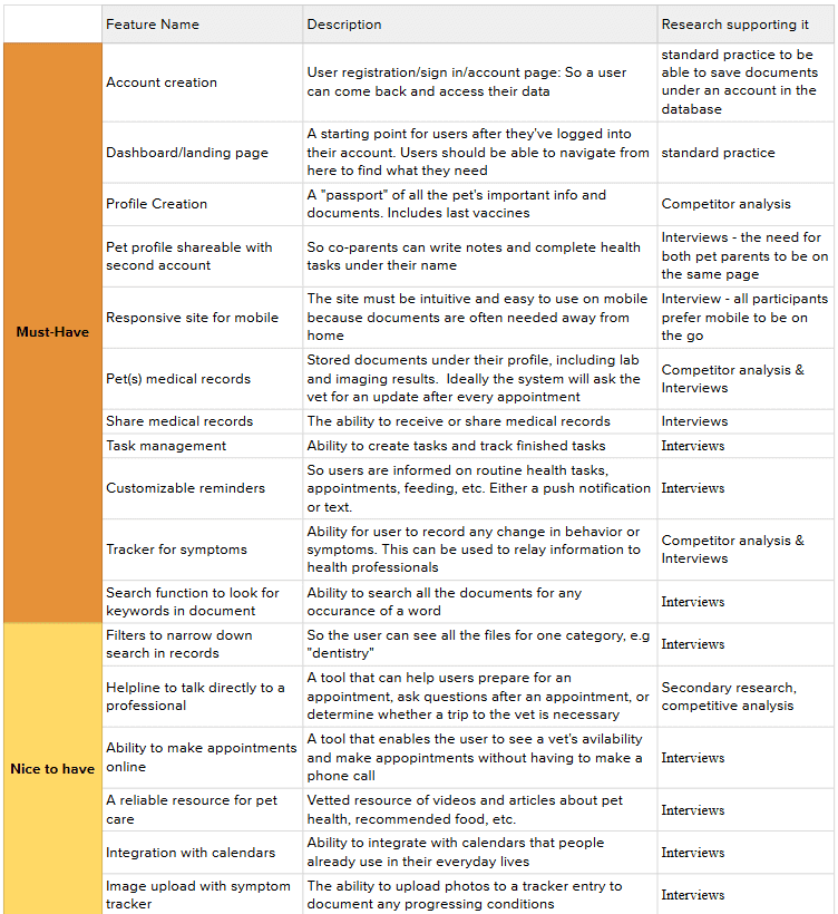
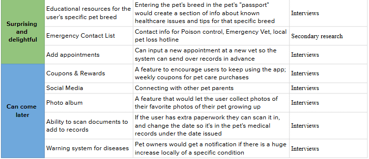
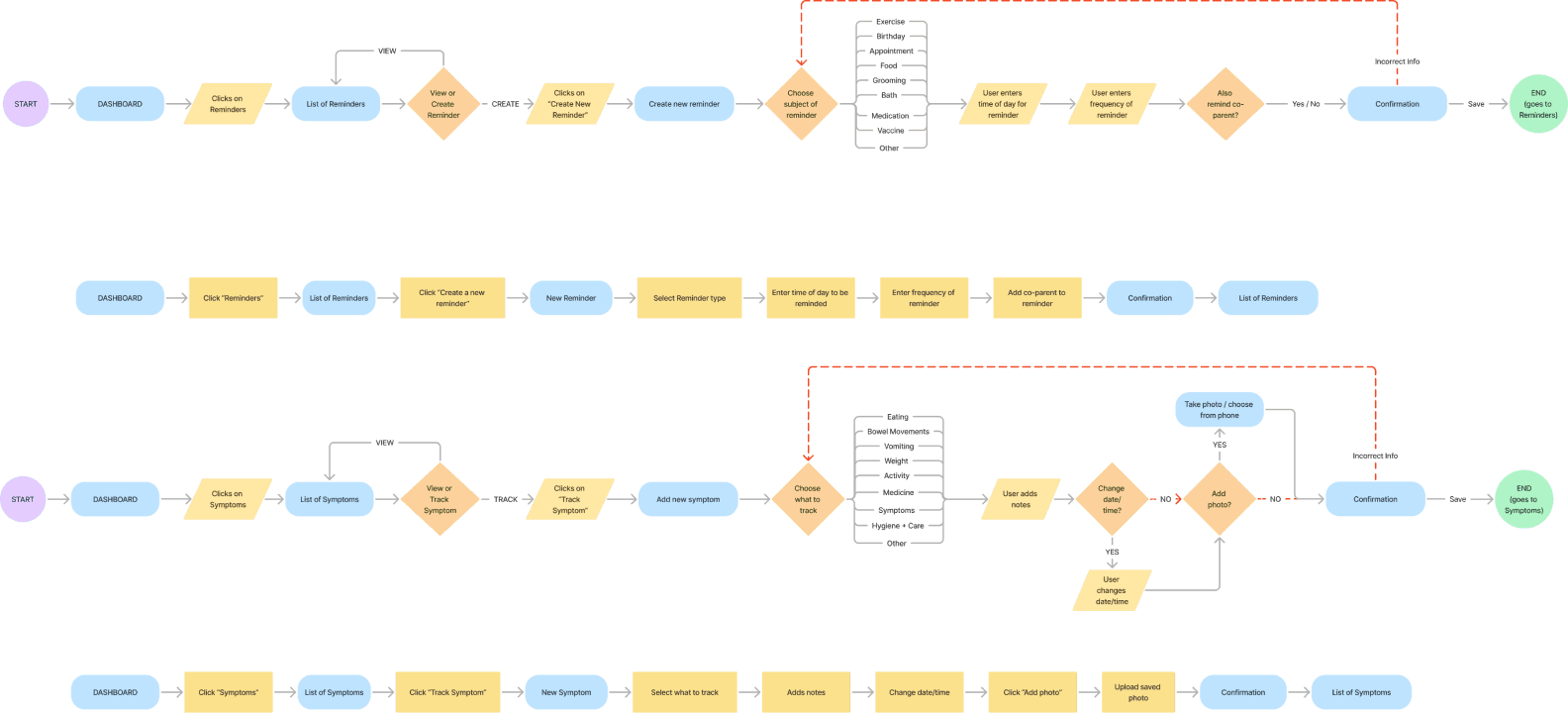
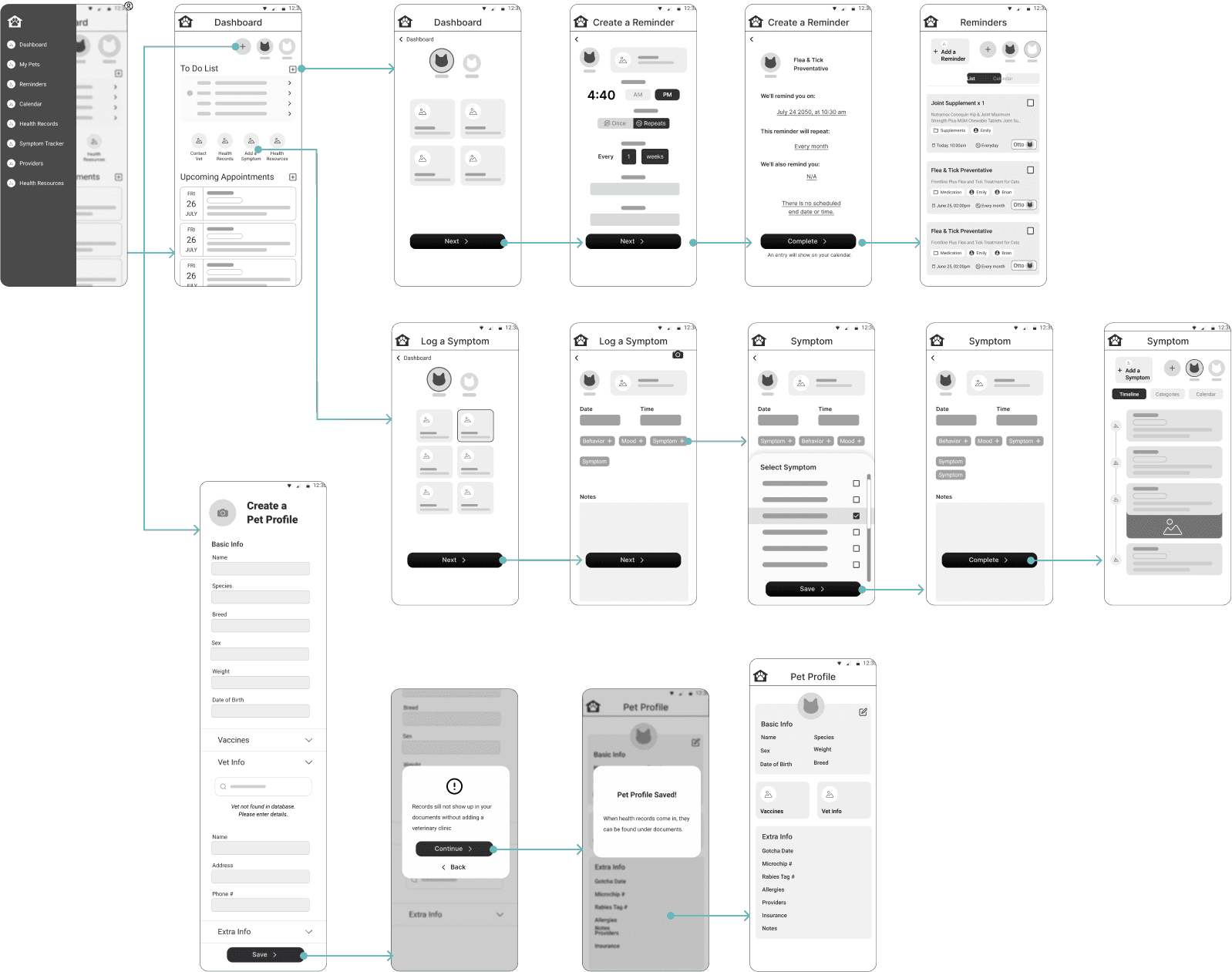
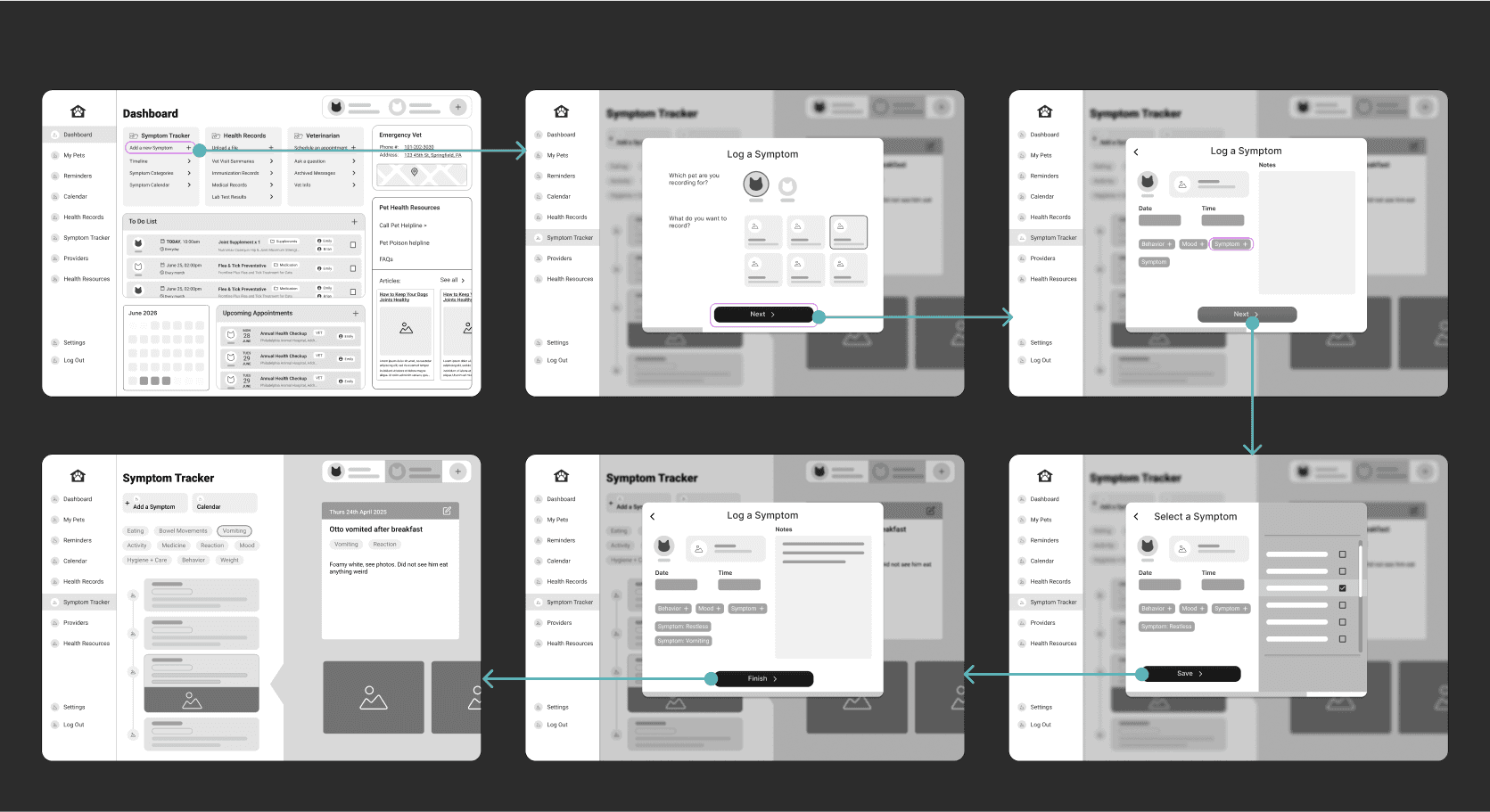
I explored different user flows to visualize different pathways for the same goal. By breaking down documenting all the possible actions a user can take, it was easier to create task flows.
I used the research to inform design decisions, prioritize accessibility, easy navigation, and evoke core values.
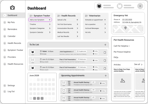
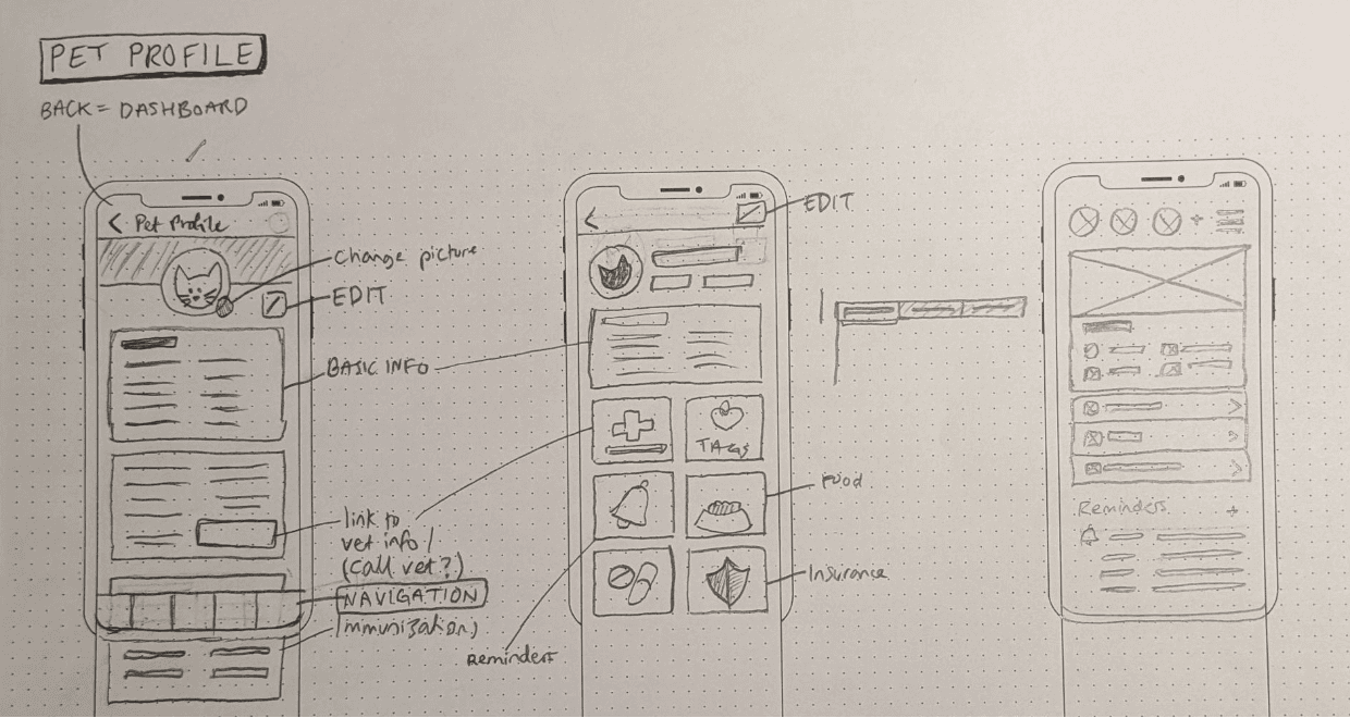
Low-fidelity wireframes
Mid Fidelity Wireframes
Color Palette
With this palette I’m aiming for the feeling of balance and harmony. The warmth of the colors are to promote warmth, safety, and care.
Logo
The logo was designed to imply that everything is gathered in one place. The logomark is still legible when scaled.
Icons
I created a few custom icons, the hardest being health resources, health records and symptoms since people are not familiar with them. They are always labelled however, and are easy to get used to when more time is spent on the site.
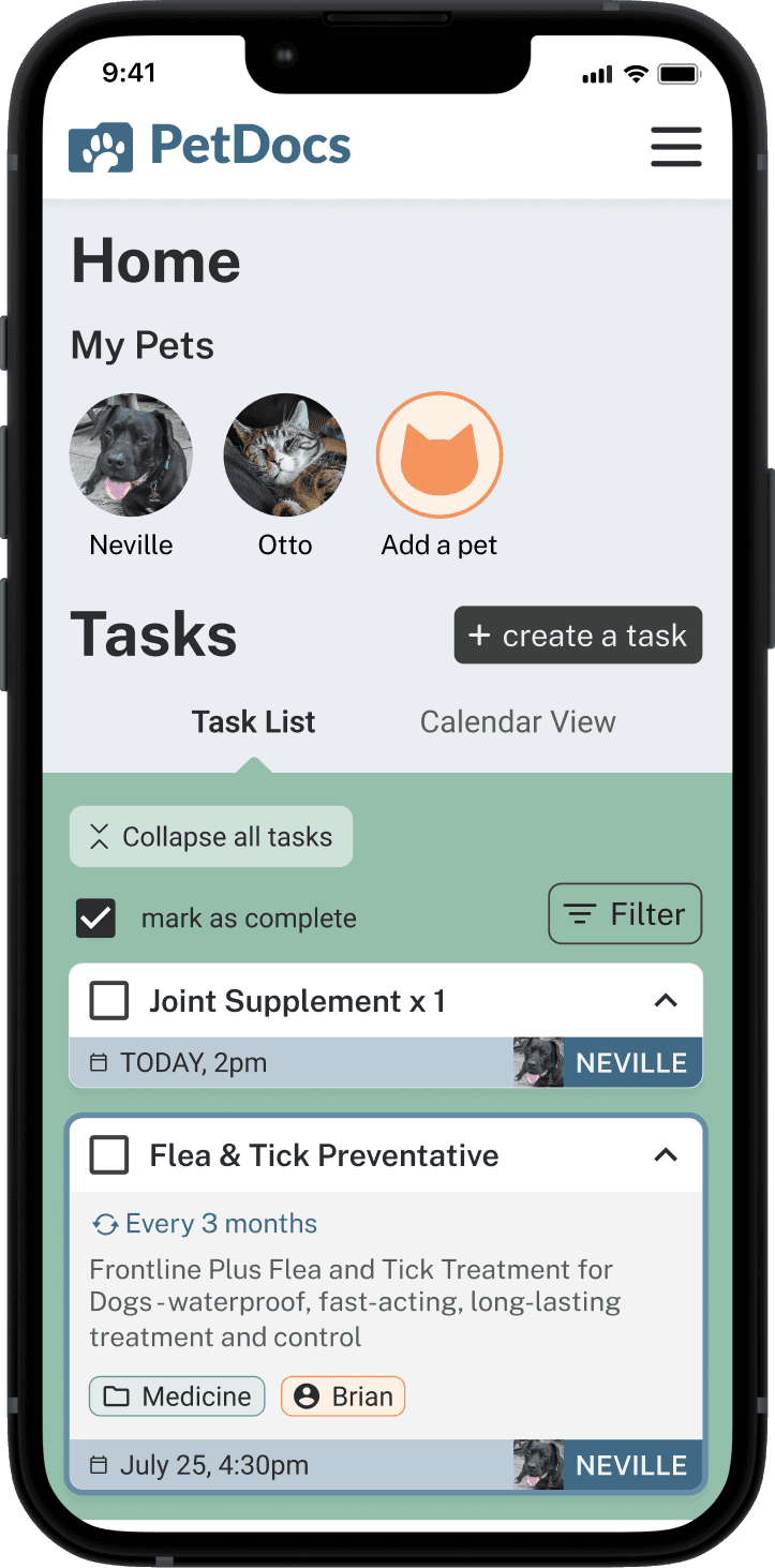
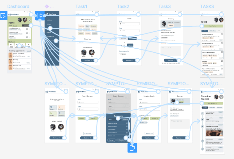
I connected the high-fidelity mockups to make a working interactive prototype, to be able to test the flows I created
Usability Testing
Using the prototype, 5 participants tested out 2 flows.
I wanted to make sure of three things:
evaluate whether the site is intuitive for the user to navigate as they complete tasks
to find pain points and opportunities for improvement
to learn how users feel about the overall visual design of the interface, and whether the design decisions lends itself to the core values of simplicity, organization, care, friendliness, and care.
Key Takeaways
All participants were able to complete both tasks quickly.
The task flow was easily followed and understood
Design patterns were recognized without hesitation
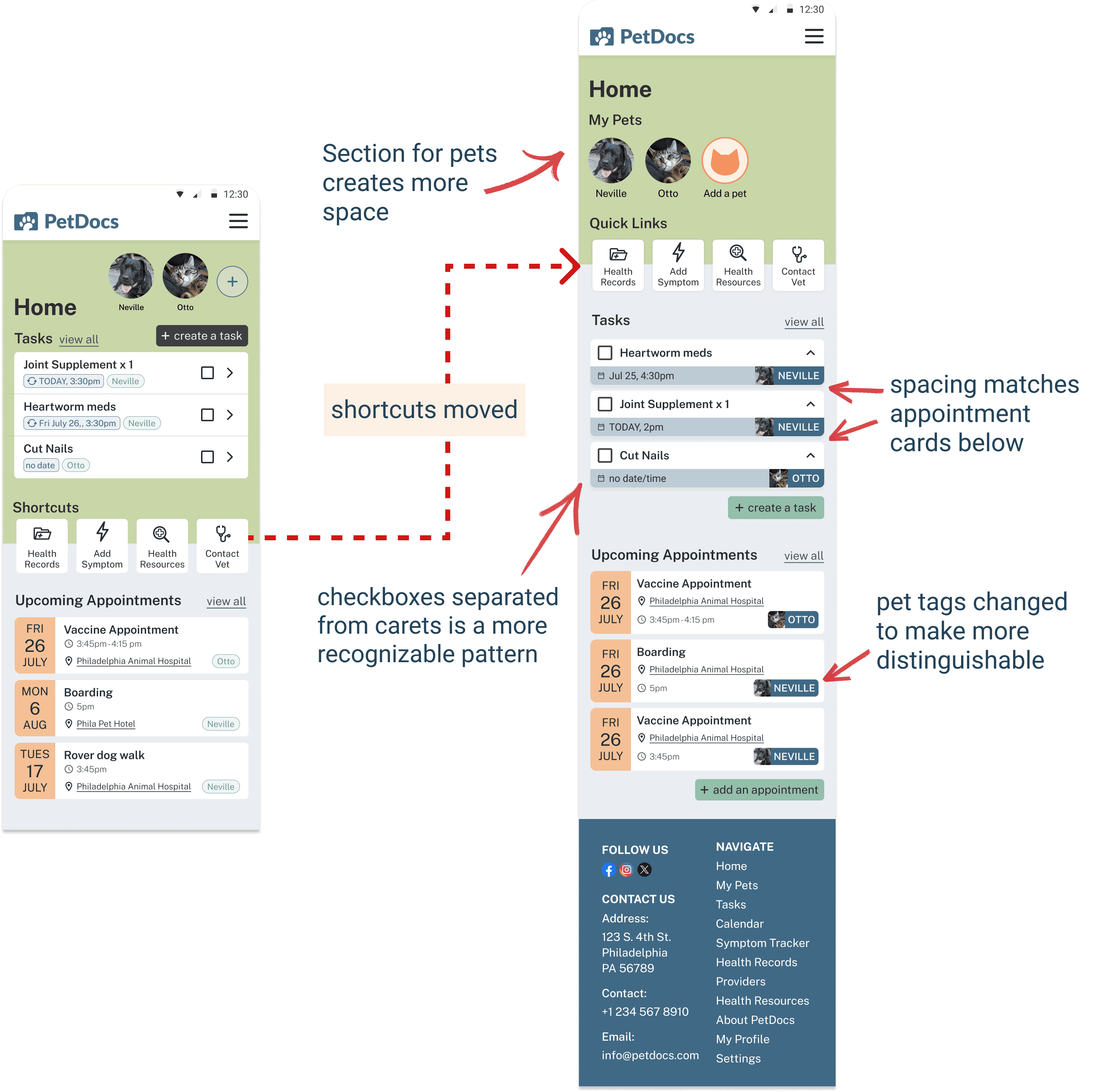
The hardest part, at least for 3 participants, was the starting point on the “dashboard”. People's eyes were drawn to the profile pictures and shortcuts first.
Apart from any initial hesitations on what to click on first, all participants said that the flows were very smooth.
The colors seem to also be successful as well as the layout of the information,
The dashboard is visually overwhelming
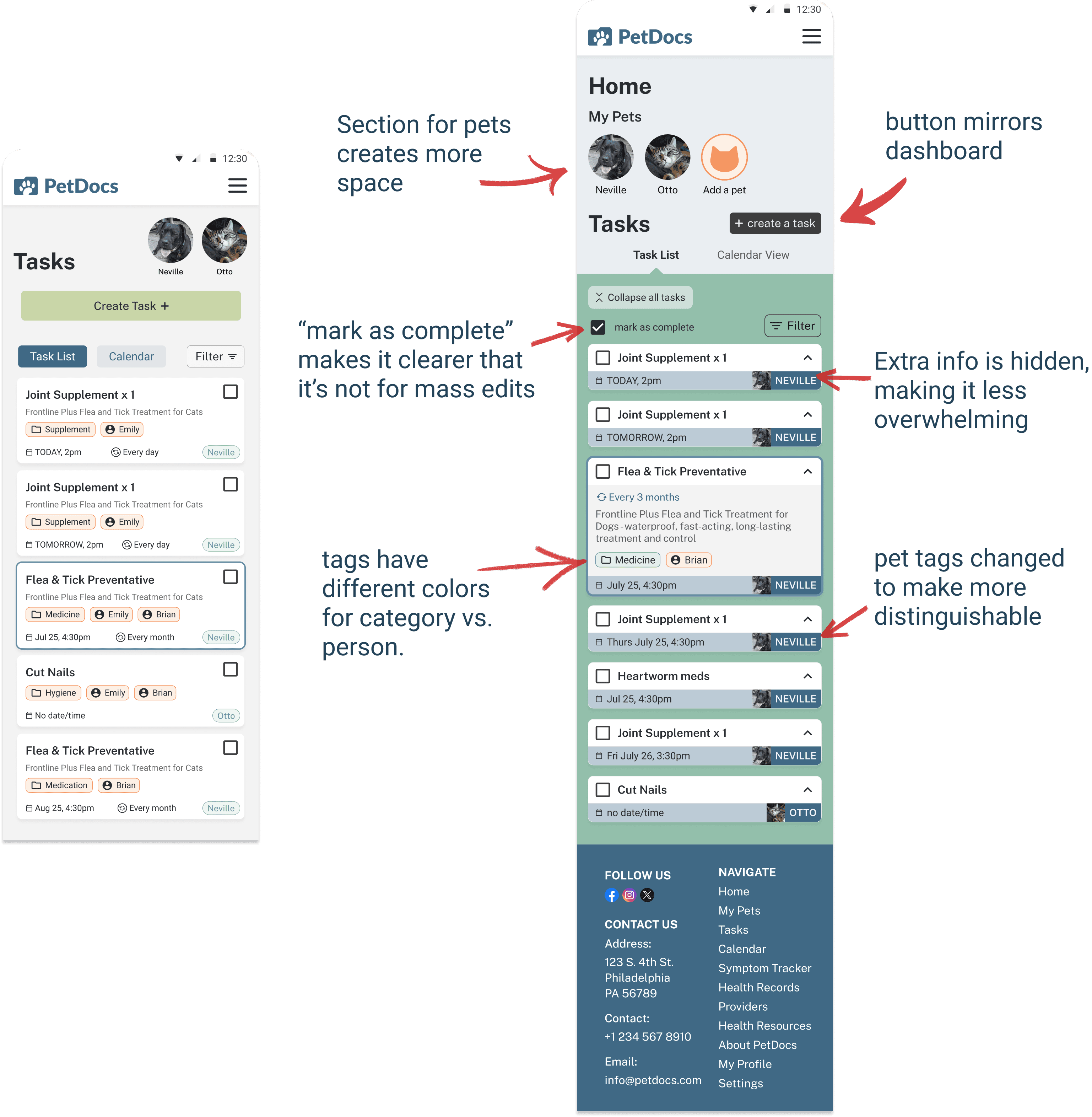
Making Improvements
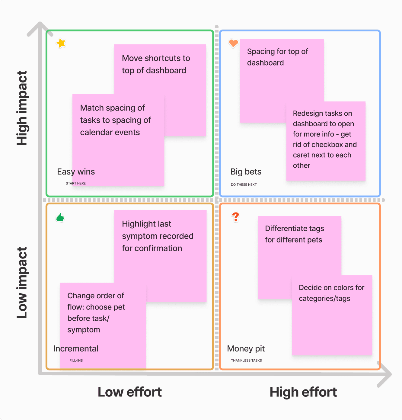
For the first round of iterations, I placed the issues on a prioritization matrix based on frequency and severity. This helped me to understand what needed to be worked on first.
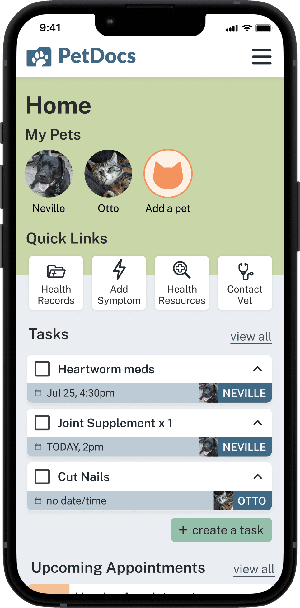
Final Interactive Prototype
Continuing to evolve
Ideally the platform would be fully developed. Building out the other features could also enable users to complete tasks using different paths (like through the menu). The other features would make the website comprehensive - like the capability to communicate with your vet, make appointments with your vet, and access health documents. However, in order to do this it would be very labor intensive as the site would need to pull data from the vet clinic, and we would need the vet to use a specific management system that is compatible.
Conclusion
Users were able to complete tasks very quickly and without any guidance.
If there were any hesitations it was easily learnable
Testing your assumptions with usability testing is crucial to make it intuitive for anyone.
Predictability and consistency in the UI and flow is important for navigation
