The Project
feature
Methods
Tools
Figma
Maze
Zoom
Context
Gmail’s default inboxes help by automatically sorting emails, but they don’t solve everything. Important messages still get mixed with consumer emails that quickly become clutter.
For those who want more control or feel overwhelmed by email backups, organization remains a challenge.
Problem
People who lack the time or know-how to organize their inbox often struggle with where to start or find it difficult to take the extra step.
How might we create a process that guides a user through minimizing their inbox?
I used various research methods to gain both a high-level overview and detailed personal insights into email organization.
Finding opportunities:
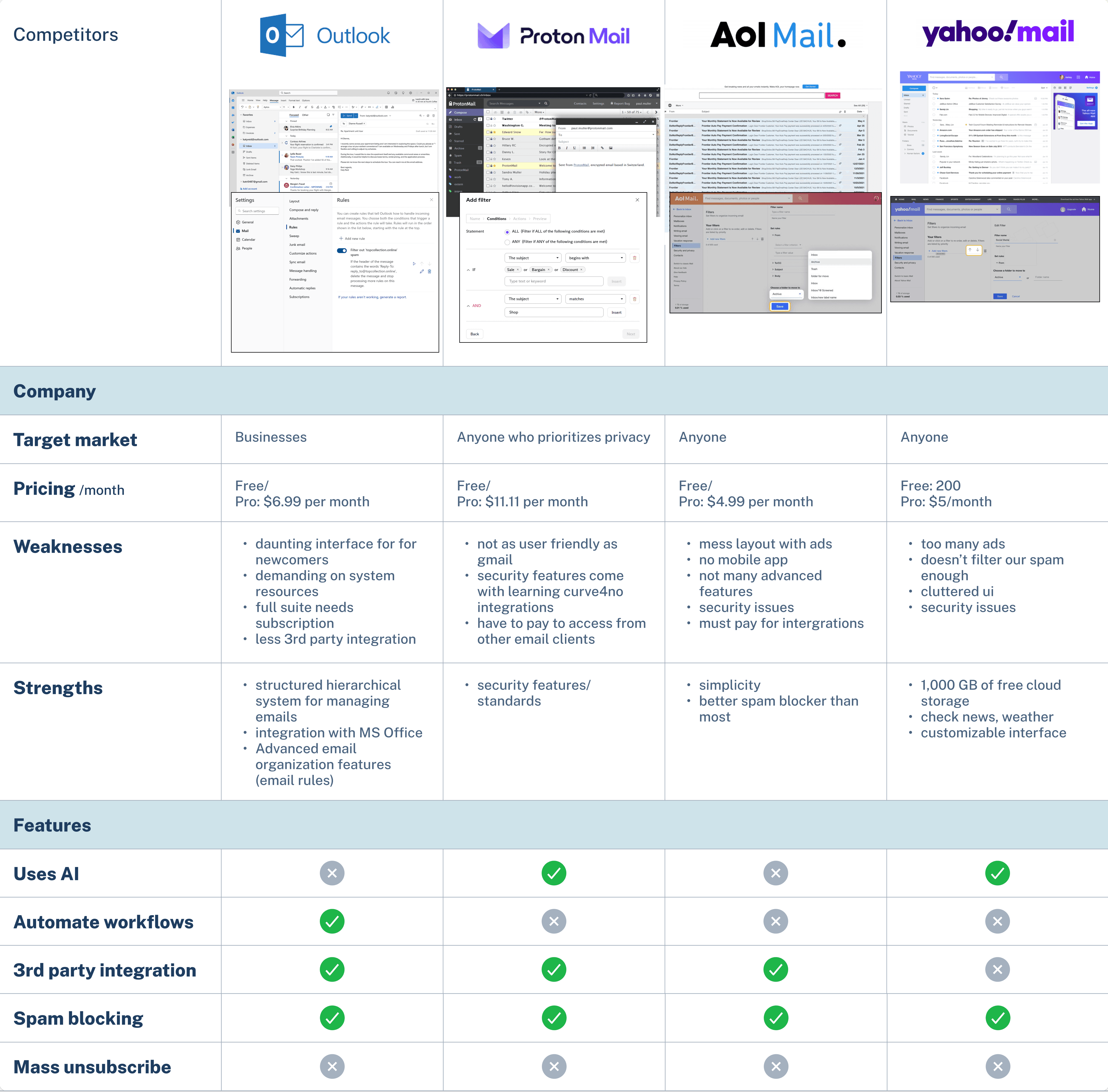
Competitive Analysis
Identify tools that current email platforms use, and in what context.
Find out what makes people choose one service over another.
Understanding the experience:
Primary Research Interviews
What organizational systems people have tried, and what worked for them.
Pain points of having a unwieldy inbox.
What features would be useful for email management
Evaluating other email services helped me understand the market and what makes a service more useful or frustrating.

To refine the problem I was solving I needed to find out first hand how people use the service, their mental model for any organization systems that they have, and whether they could use a built in organization tool. I wanted to see if customized rules or assistance with unsubscribing would be useful to people.
Affinity maps, personas, and empathy maps helped distill qualitative data, revealing diverse email organization habits. Some aim for “inbox zero,” while others don’t sort at all. These are quite different mindsets and needs and I wanted both to be represented. Based on the primary research, I identified two user personas: Alex: the hands off user and Jen: the attentive user.
I used empathy maps to better understand a user's mindset and look for any unspoken needs. This process helped me realize that someone like Alex might feel overwhelmed before even attempting to organize, impacting their approach.

Many of the people I interviewed had pain points with existing solutions—but the effort required to implement them was often a barrier. Just figuring out how to start was enough to prevent action.
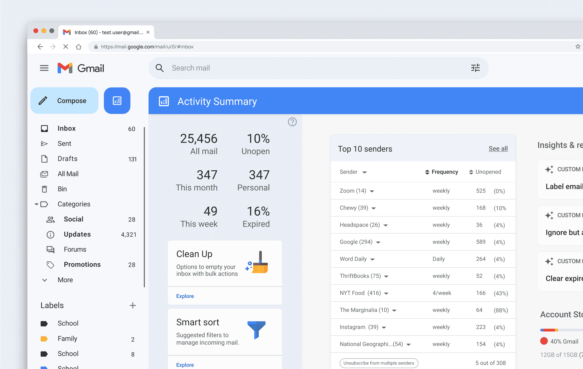
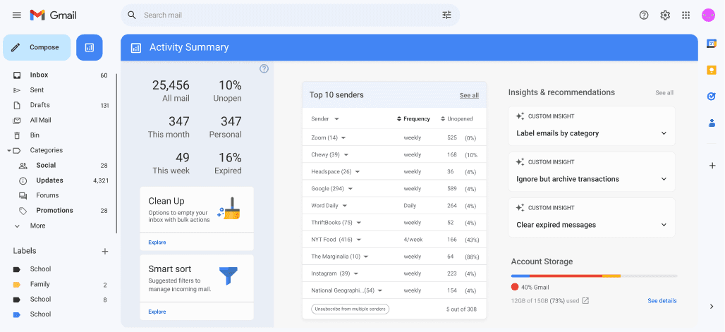
I set out to design a dashboard that gives users insight into their inbox habits and contents. By visualizing email activity, users could make more informed decisions and identify clear starting points. To keep the scope manageable, I focused the feature on one specific aspect of inbox organization: unsubscribing from mailing lists.
I identified what needed to be designed and tested to demonstrate the tool's viability using user flows and task flows. The goal was for the user to be able to see how many emails they were getting from one company, and being selective about which addresses to unsubscribe from.
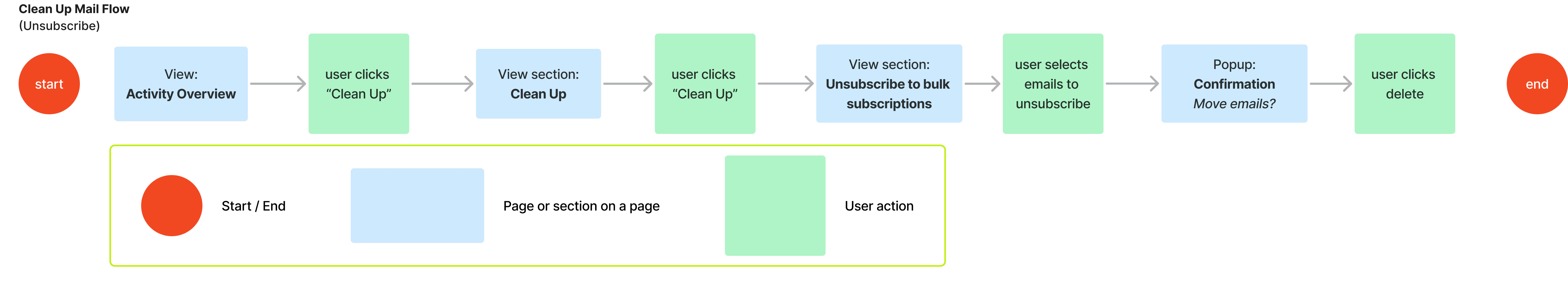
the task flow from the Activity Summary to unsubscribing from an email sender
Although I am focusing on the user experience of people who are overwhelmed by their inbox, I wanted it to be intuitive and useful for different kinds of users.
Task 1: You’re trying to find ways to minimize your backlog of emails, what would you do?
Task 2: How would you unsubscribe from Chewy’s promotional emails while keeping important ones, like receipts and customer service messages? How would you delete the unwanted emails afterward?

wireframe flow from the Activity Summary to unsubscribe from an email sender
Getting feedback at this stage was crucial to make sure I was going in the right direction before sinking time into the visual details. With low fidelity wireframes participants are able to focus on navigation, layout, and content hierarchy instead of being distracted by unpolished UI. I used the low fidelity wireframe prototype to evaluate a few things:
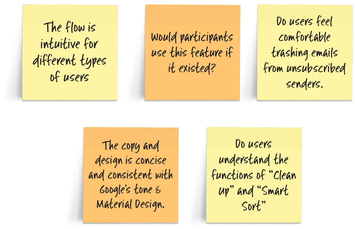
Based on feedback from wireframe user testing, small adjustments were made to the dashboard and unsubscribe page. The dashboard had to be simplified but I wanted to find the balance between having too much information and not having enough for the user to customize things to the way they work.
The deselection interaction for the email address pills on the unsubscribe page was emphasized, and realigned with the user expectation of not having anything selected as default


Testing an interactive high-fidelity prototype with enhanced visual feedback and button states allowed me to assess how users perceived the feature, whether it met their expectations within the Google ecosystem, and if it established trust.
I used the same task and questions to confirm that the problems had been resolved with 5 new participants . Additionally I asked about any further pain points and whether the feature matches Gmail’s design, feel, and flow.

An indicator was added to show that there are tool tips