
The Project
native mobile app
Methods
Tools
Figma
Zoom
Maze
Problem
With e-commerce’s rise and reliance on exploitative labor, the cycle of consumption and disposal continues to accelerate. Many want to reduce their impact. and try to buy less and choose to to find things secondhand, to cut waste and new demand for goods.
Though online platforms facilitate item exchanges, there’s untapped potential to use these transactions to foster a stronger culture of community support and mutual aid. I’d like to explore ways to encourage people to take the extra step and reach out to their community before buying new or throwing things out. People like to help others and feel connected to their neighborhood.
How do we make posting items as easy and appealing as donating them to a center?
Solution
An app where users can easily list items, request what they need, and coordinate pickups - or simply alert neighbors about a free box with no coordination required. By encouraging fair offers and lending, with the option to remain anonymous if needed, the app fosters trust and inclusivity.


I knew that finding specific things you need could be challenging, while clearing your home of things you don’t need can feel arduous. However I didn’t want to just follow my assumptions so I used different research methods to achieve my objectives.
Finding opportunities:
Competitive Analysis
Identify the most commonly used apps for peer-to-peer marketplaces
Investigate their pain points, advantages, and differences.
Understanding the experience:
Primary Research Interviews
What people would expect from a marketplace app for only free things.
Affinity mapping showed that the visual impact is one of the factors that is used to decide on where to go. Without visuals, people often want a recommendation from someone they know. Social media came up frequently - not only as a way people discover places, but also as proof that a business is vibrant and active.

I wanted to understand the experiences of people leaving things on the curb or finding them. I wanted to find out what motivations, challenges and behaviors surround the use of existing peer-to-peer marketplaces. I conducted interviews with six adults with an age range of 29 - 64 who regularly get things for free or want to give things away.
While some see keeping items out of the trash as a bonus, others view it as a key motivation.There a few baseline assumptions that I wanted to make sure I could validate:

I was also mindful of the risks involved in talking to people. Their motivations for giving away or picking up items can be complex, influenced by economic, social, and environmental factors that are hard to fully capture. Responses may also be biased, such as wanting to appear more eco-conscious.
Based on the primary research, I identified two user personas: Elizabeth representing those who mostly gives things away, and Em representing users who mostly acquire items. Having these personas as a reference ensured that I stayed aligned with user needs and avoided straying from the problem I was trying to solve.


Using a persona, I developed a user journey map for the task I wanted to eventually test: finding used furniture. By parsing out the highs and lows that a user may experience, I could focus on an opportunity where the app can do some heavy lifting.

I had many ideas for features that would make the app more useful and stand out amongst competitors but ultimately many of the pain points identified by the participants interviewed were better suited to minor enhancements that would elevate the experience and differentiate the product in the market.

In Notion I could see all the features together, understand which ones depend on others and what it tag by aspect of the app would it improve.
For the MVP, I chose to prioritize addressing a core need: enabling users to easily acquire items while focusing on the relevant pain points. The most important aspects of the app for users are:
Ease of use
For posting item information and description, even for more than one item.
A chat bot to help efficiently communicate for logistics and help prompt users
Reminders to users receiving items to be communicative and follow through.
A sense of community
Community guidelines before interactions and actions
Ability to flag inappropriate posts or behavior
Contribution “badges” to create trust between users
The option of keeping personal info private, and the ability to give a vague location.
Ability to find relevant things
Categorization, labels, filters
Easy way to update listings
Notifications for curbside things that you have selected that you’re interested in.
The option to request something you need, and see all requests
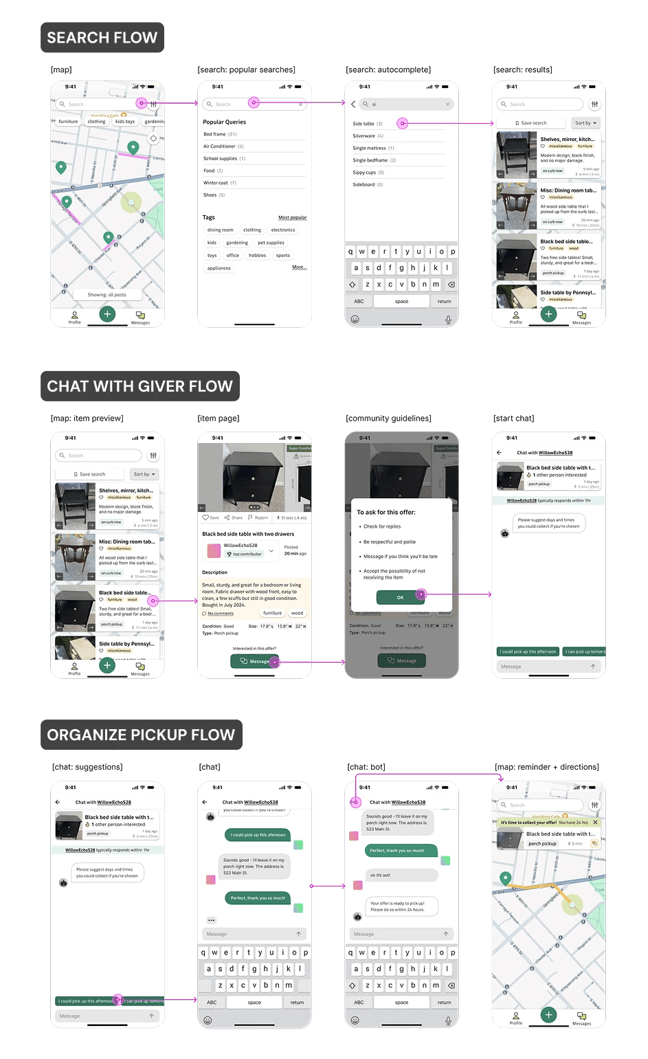
To identify the key screens and prioritize what would need to be developed first, I mapped out the main functions and user flow for the app as a whole.

I used a rudimentary figma wireframe prototype to assess whether the layout and task flow felt intuitive and frictionless. Six people participated in moderated think-aloud sessions, primarily testing the desktop prototype.
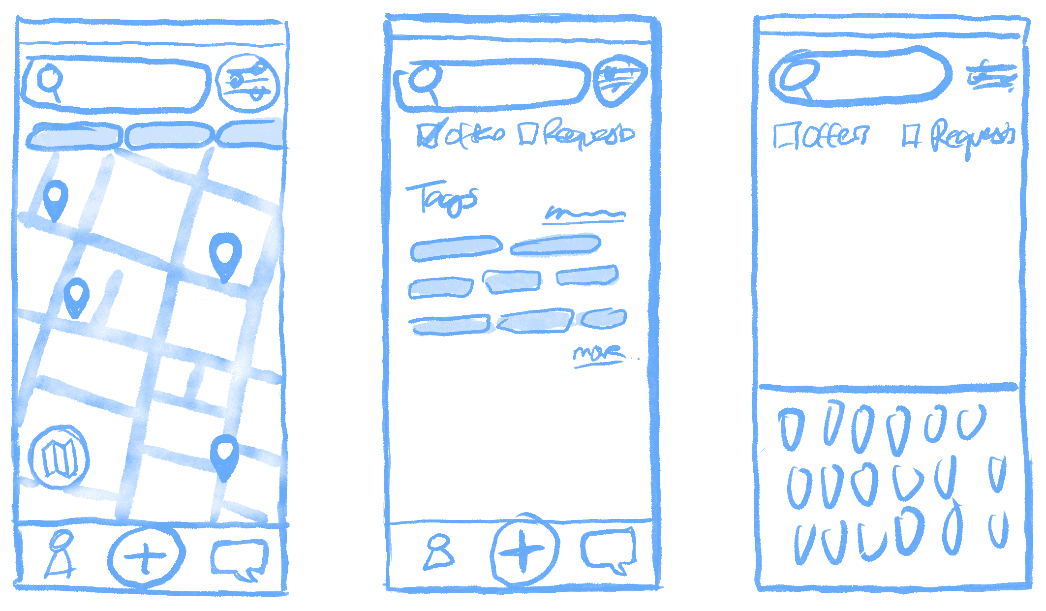
Some early sketching to get early feedback about hierarchy
11 participants completed a mix of moderated and unmoderated tests. Overall the flow was successful, with 75% rating for a 4 out 5 or higher. There were some oversights with the testing and guiding the user, I did not tell them that after completing the messages that they had to go back to the map to complete the flow.

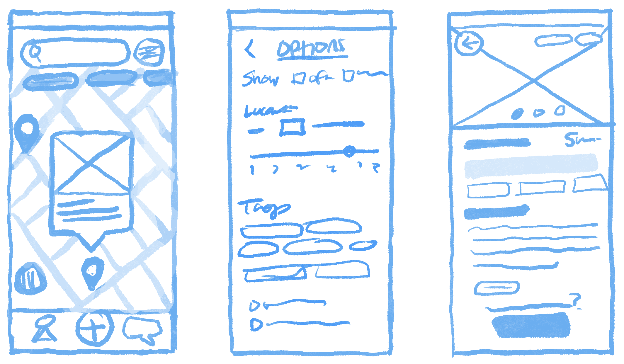
The low fidelity interactive prototype
11 participants completed a mix of moderated and unmoderated tests. Overall the flow was successful, with 75% rating for a 4 out 5 or higher. There were some oversights with the testing and guiding the user, I did not tell them that after completing the messages that they had to go back to the map to complete the flow.

Heatmaps showing the most common clicking areas
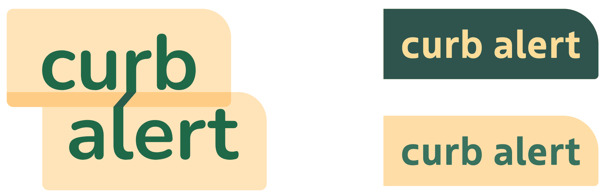
LOGO
Since decluttering or finding items can feel overwhelming, I focused on making the experience simple and organized. I named it “CurbAlert,” a familiar term, often used on Facebook, for giving away free items. The logo takes a literal approach, representing both the curb itself and the idea of connection.
COLOR
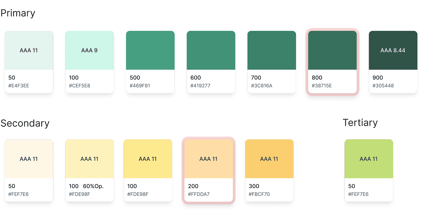
I defined the app’s brand values as community, care, generosity, and sustainability, reflected in a warm palette of greens and yellows.
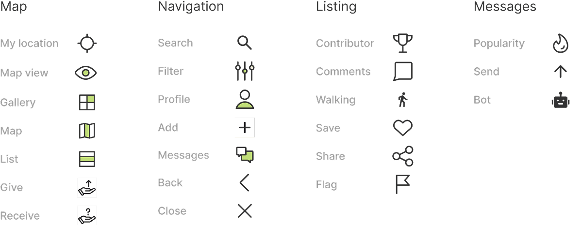
TYPOGRAPHY & ICONS

11 participants completed a mix of moderated and unmoderated tests. Overall the flow was successful, with 75% rating for a 4 out 5 or higher. There were some oversights with the testing and guiding the user, I did not tell them that after completing the messages that they had to go back to the map to complete the flow.
All participants were able to complete both tasks quickly. Two people rated the flow as 4/5, and the other 7 rated it a 5/5. Overall users found it to be straightforward, easy, and intuitive. The organization and navigation patterns were familiar and easy to figure out.
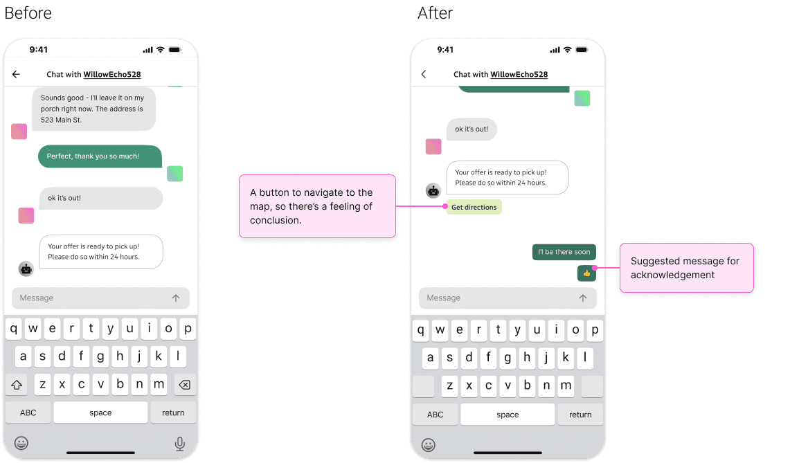
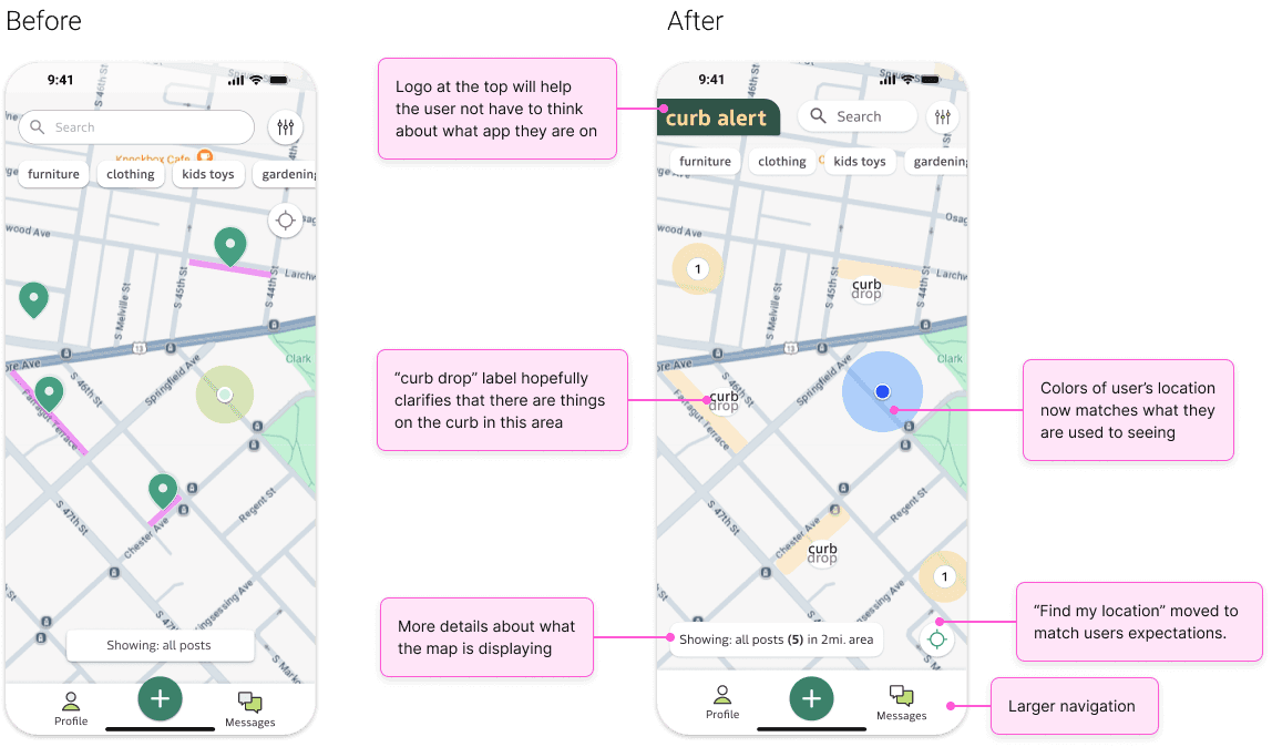
Most of the feedback I received were about minor issues, as shown below.
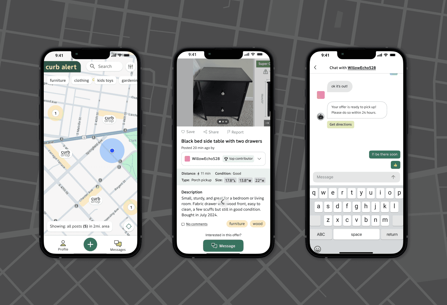
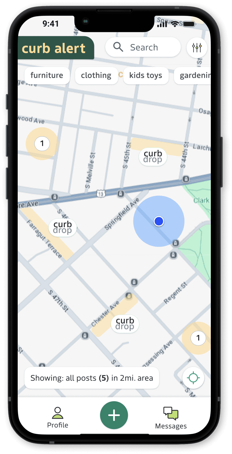
LANDING PAGE (MAP)
ITEM PAGE

CHAT PAGE